ODE TO
Typography, Book
14x10" Book
20x34" Poster
3x.25x3" 3D
Aug–Oct 2020
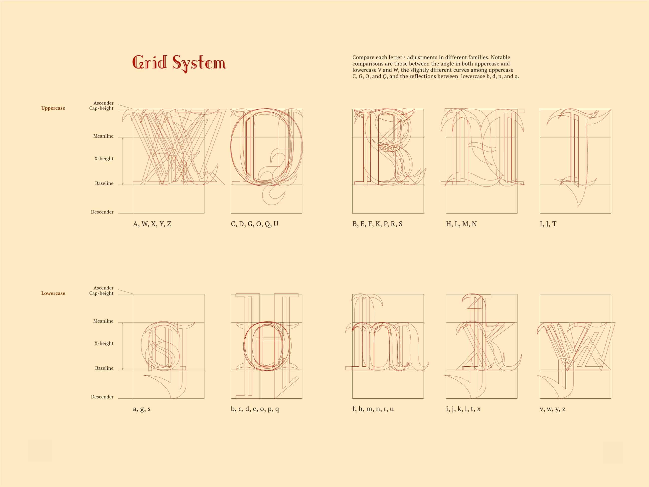
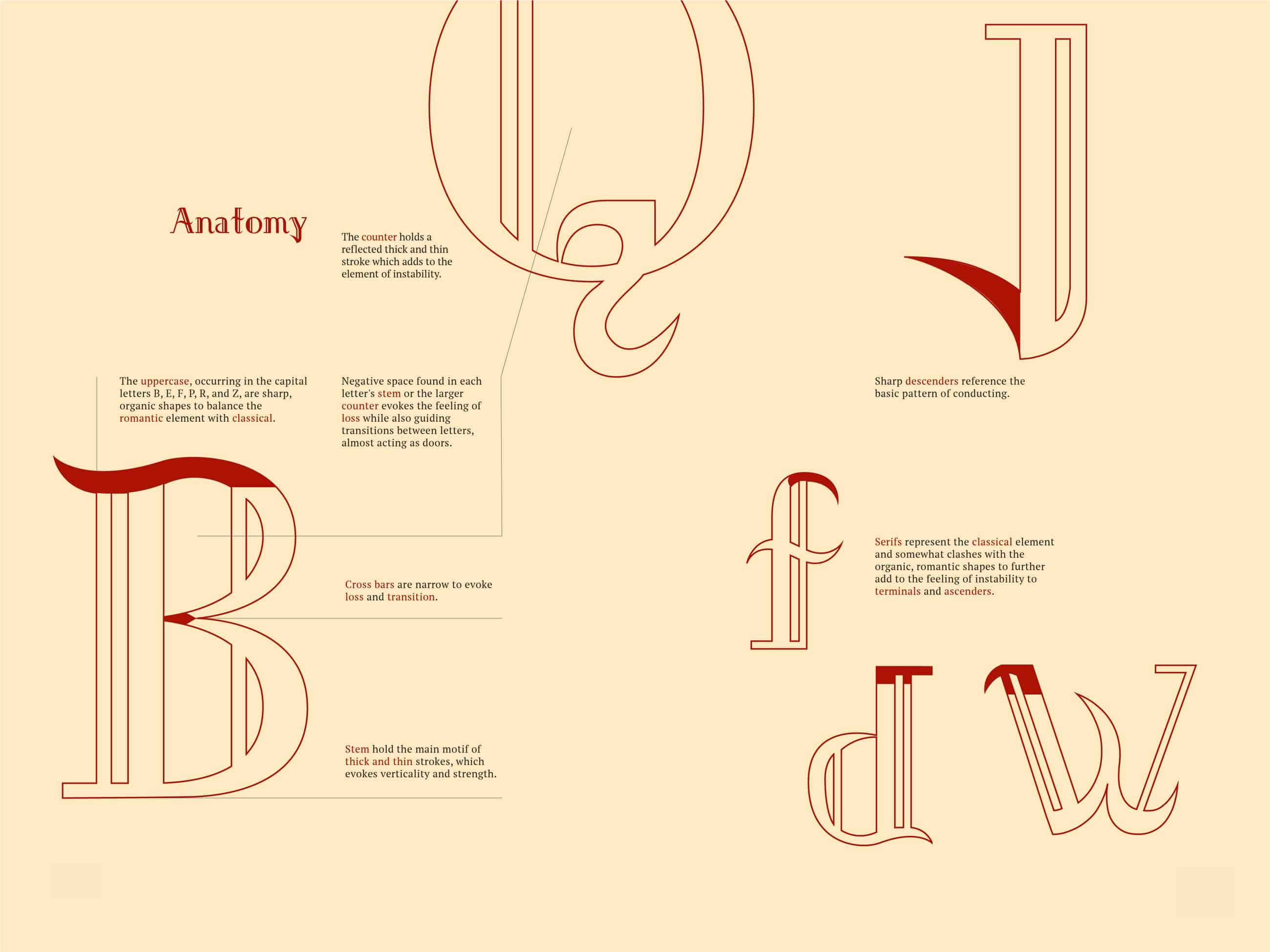
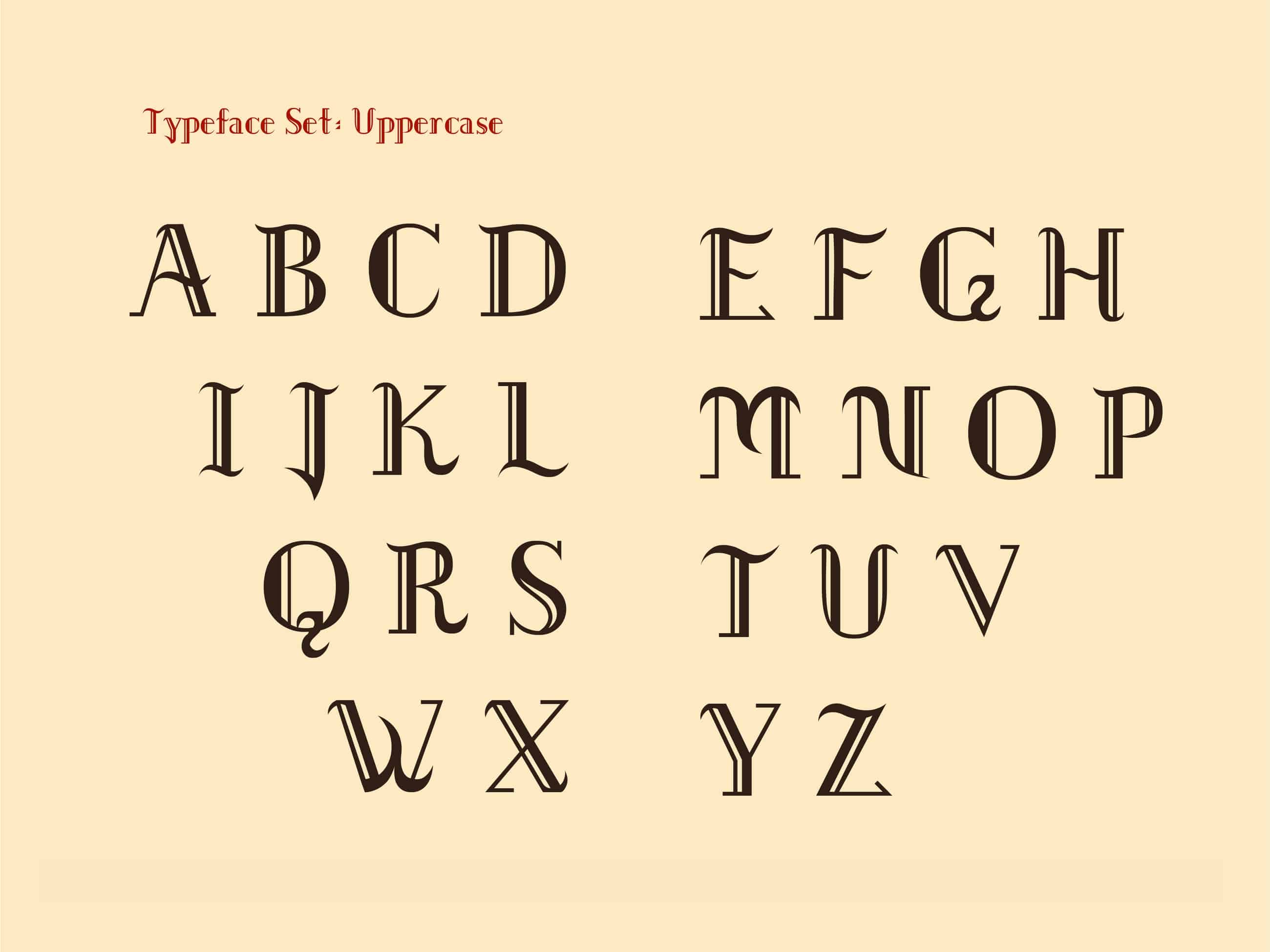
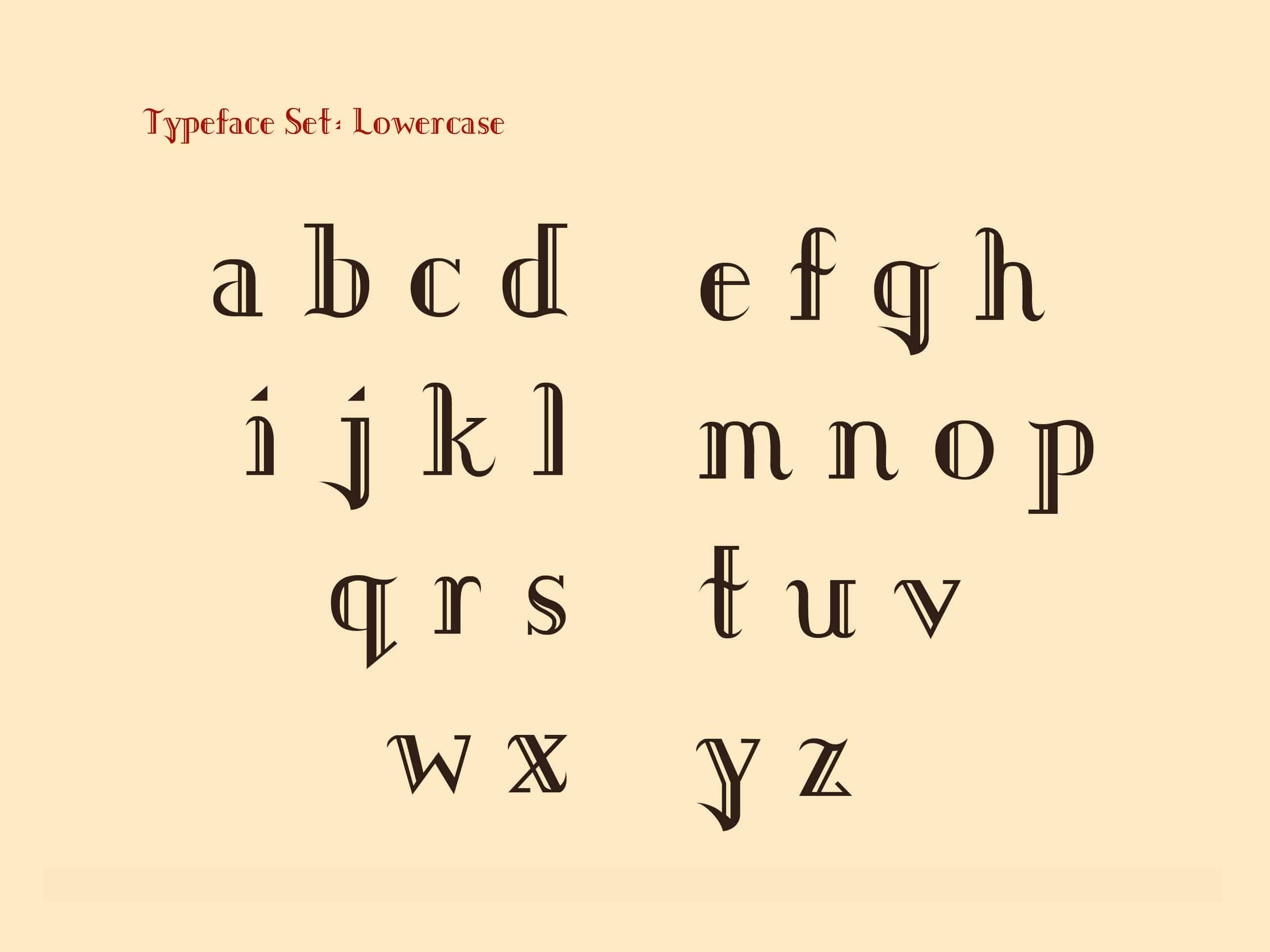
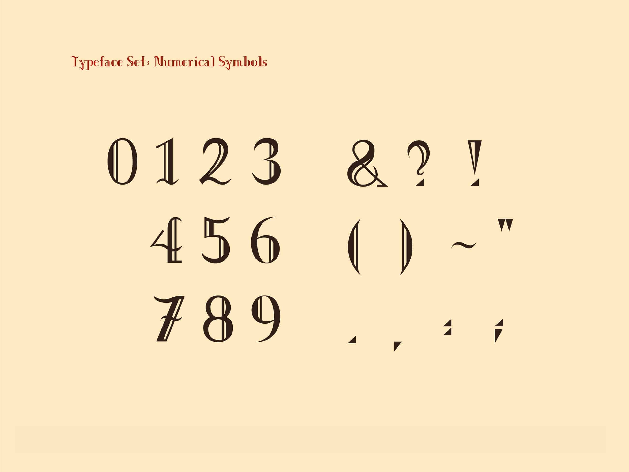
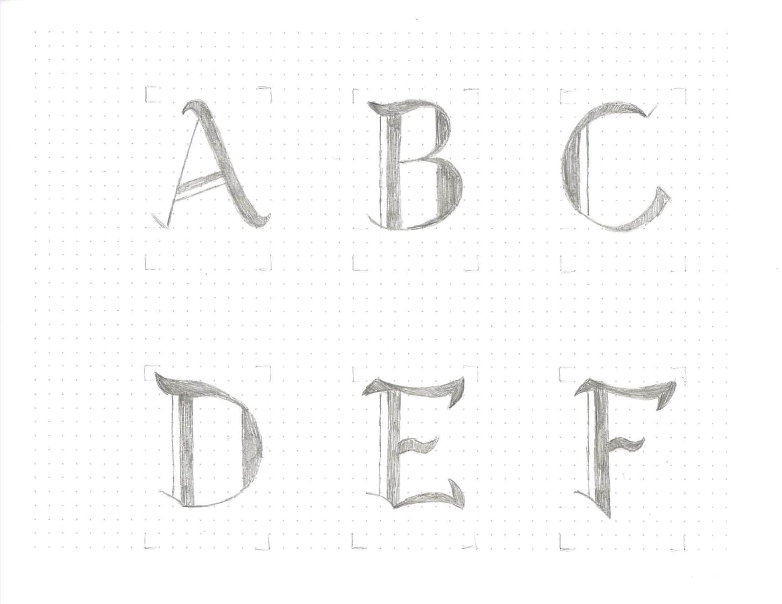
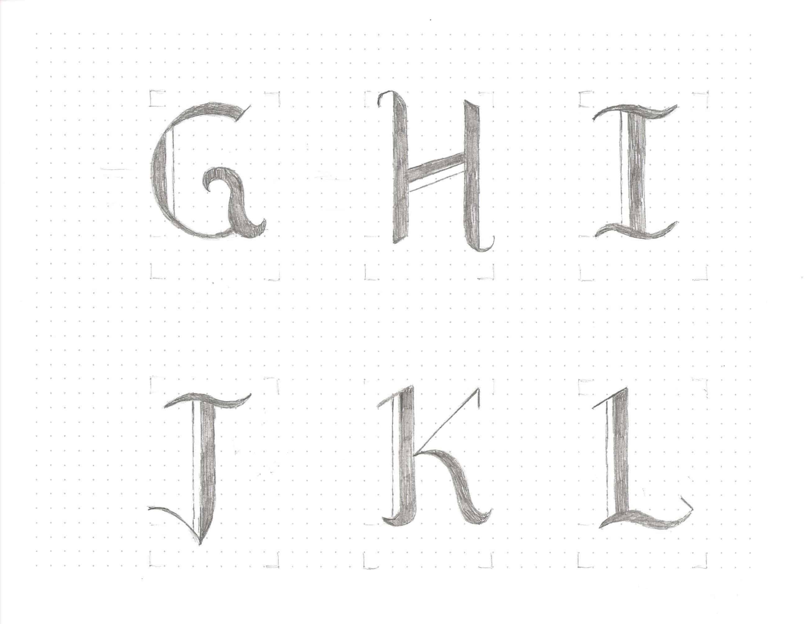
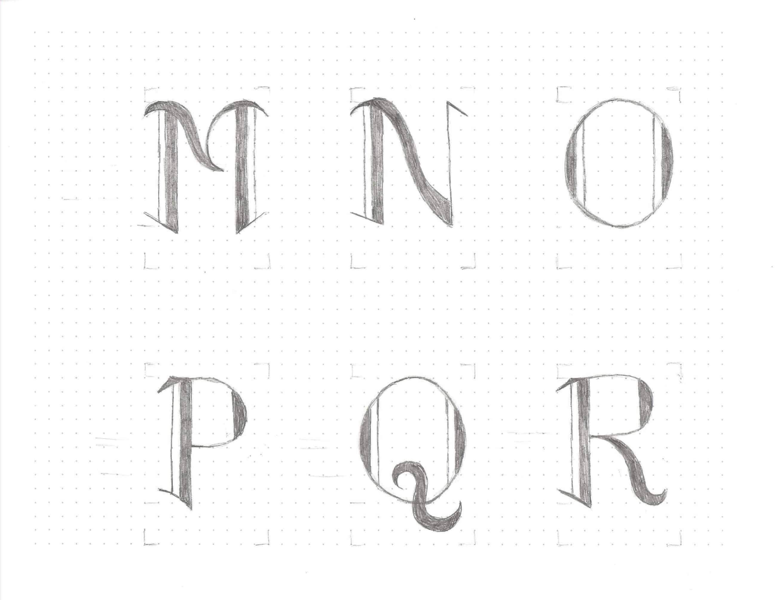
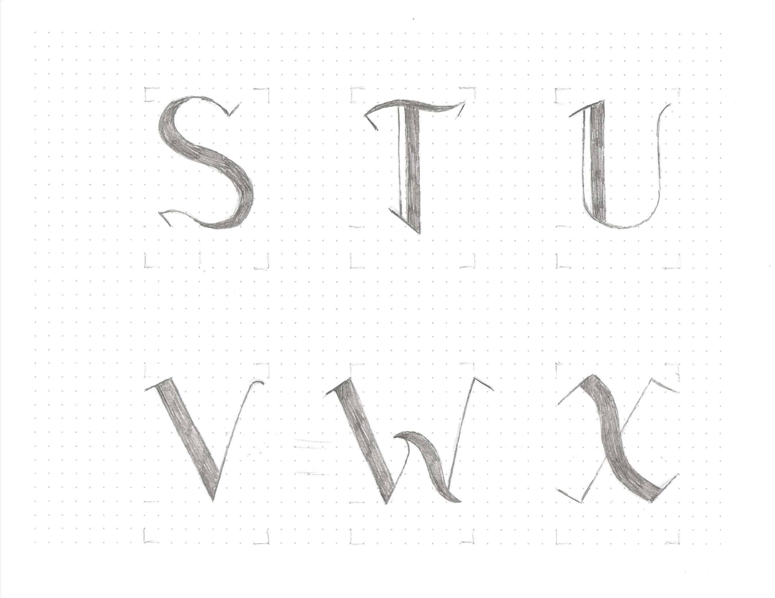
An original typeface inspired by Ludwig van Beethoven, with applications of a book, poster, t-shirt, 3D form, Rhino-Grasshopper drawing, and robot arm drawing. I picked Beethoven because of my musical background and admiration for his perseverance, work ethic, and work quality. This was my first deep dive into typography, and I especially learned a lot about the proper anatomy and proportions of each letter, seen when comparing my initial sketches to the final version.
KEYWORDS & APPLICATIONS
- Bold - Dominating thick strokes
-
Classical - Sharp, defined serifs
-
Loss - Negative space
-
Romance - Organic curves
- Transition - Thick and thin
- Unstable - Clashing elements
To play a wrong note is insignificant.
To play without passion is inexcusable.
To play without passion is inexcusable.
—Ludwig van Beethoven
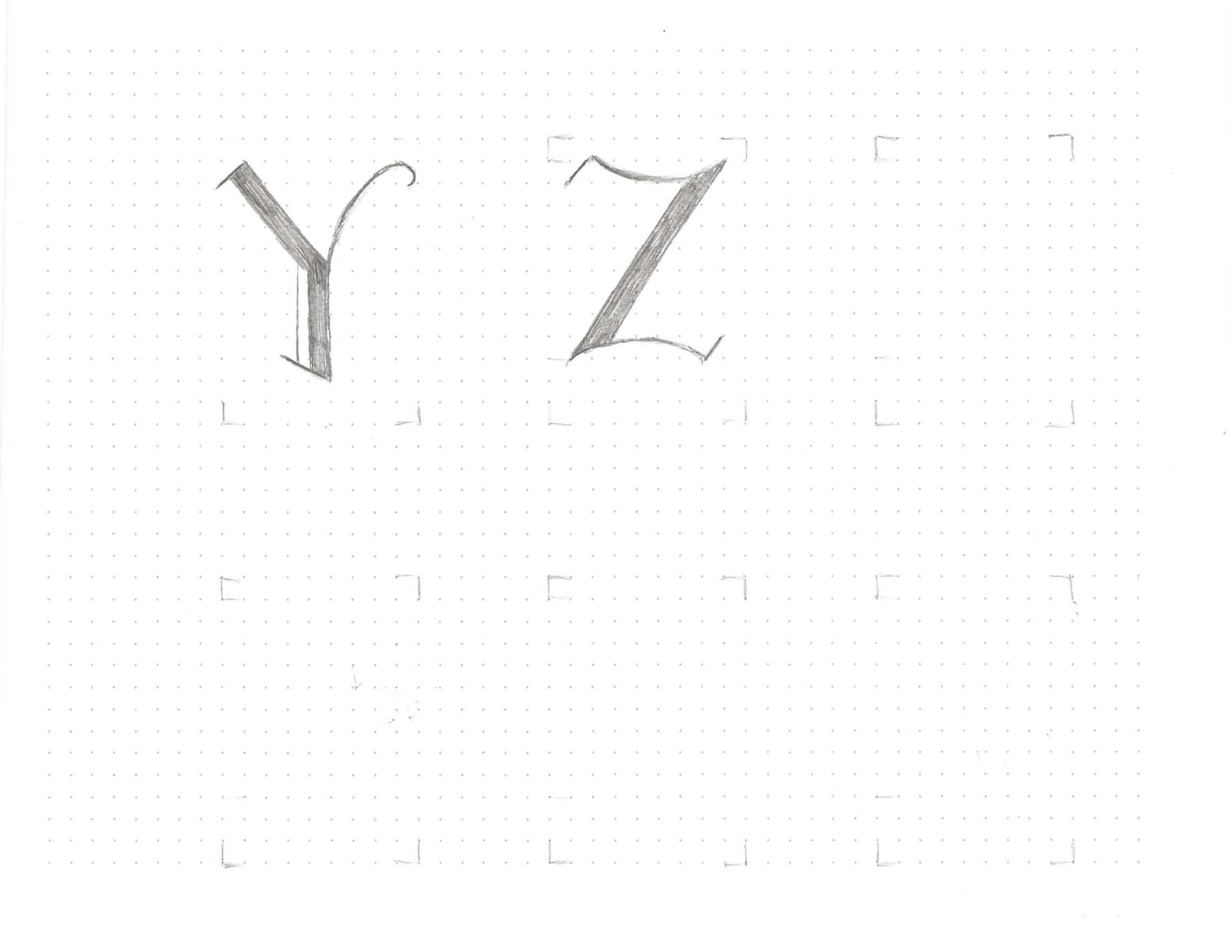
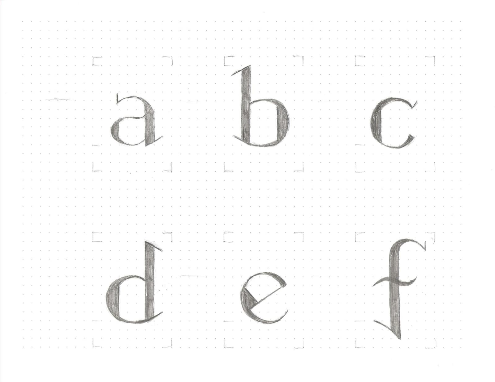
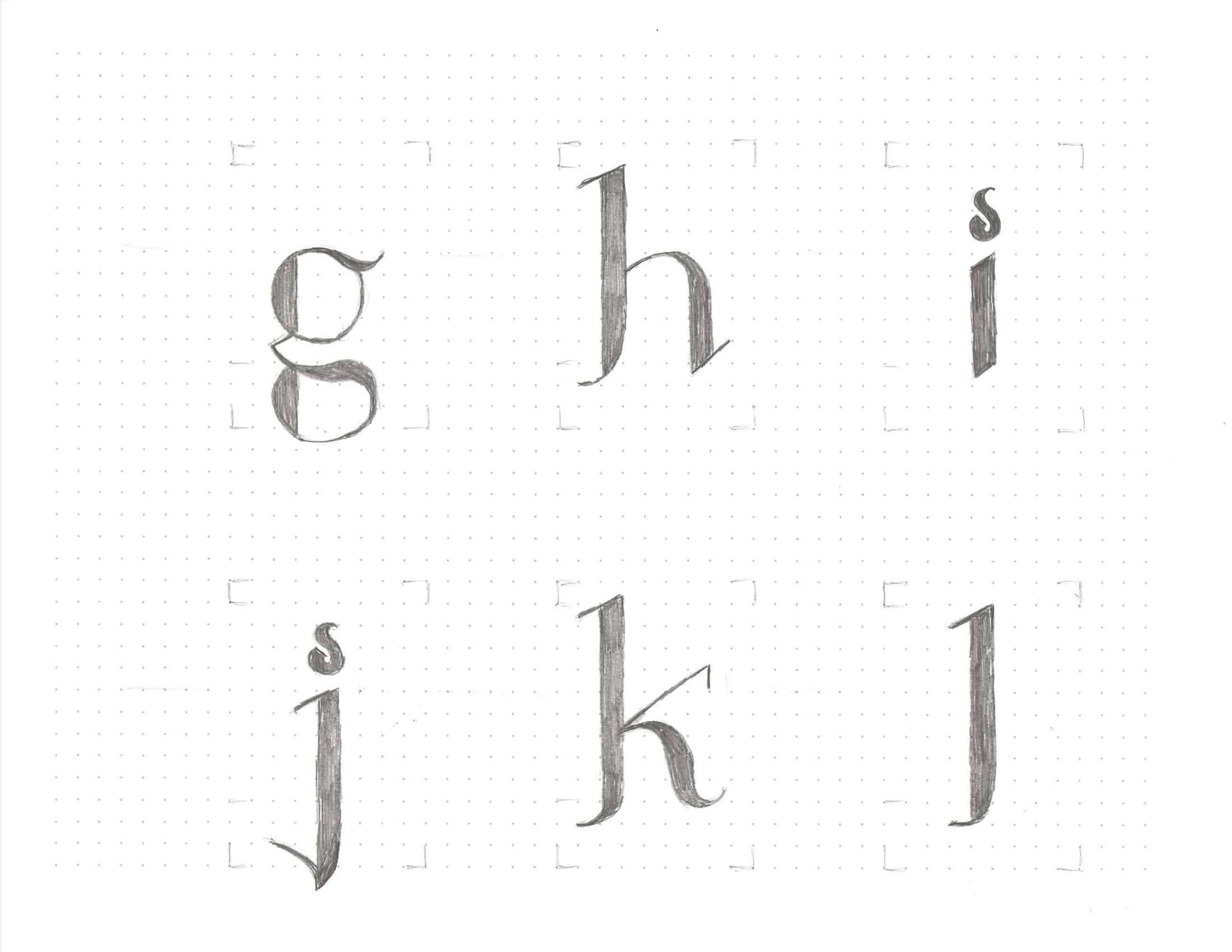
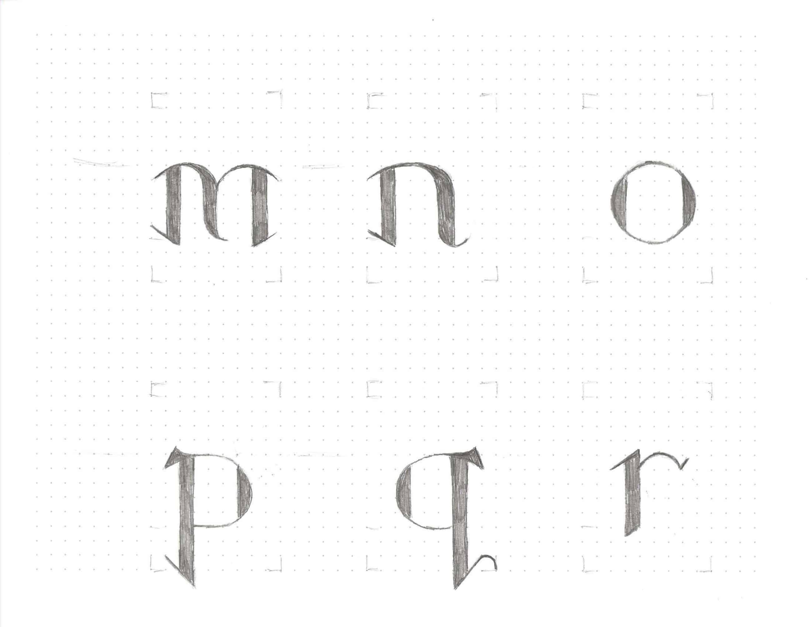
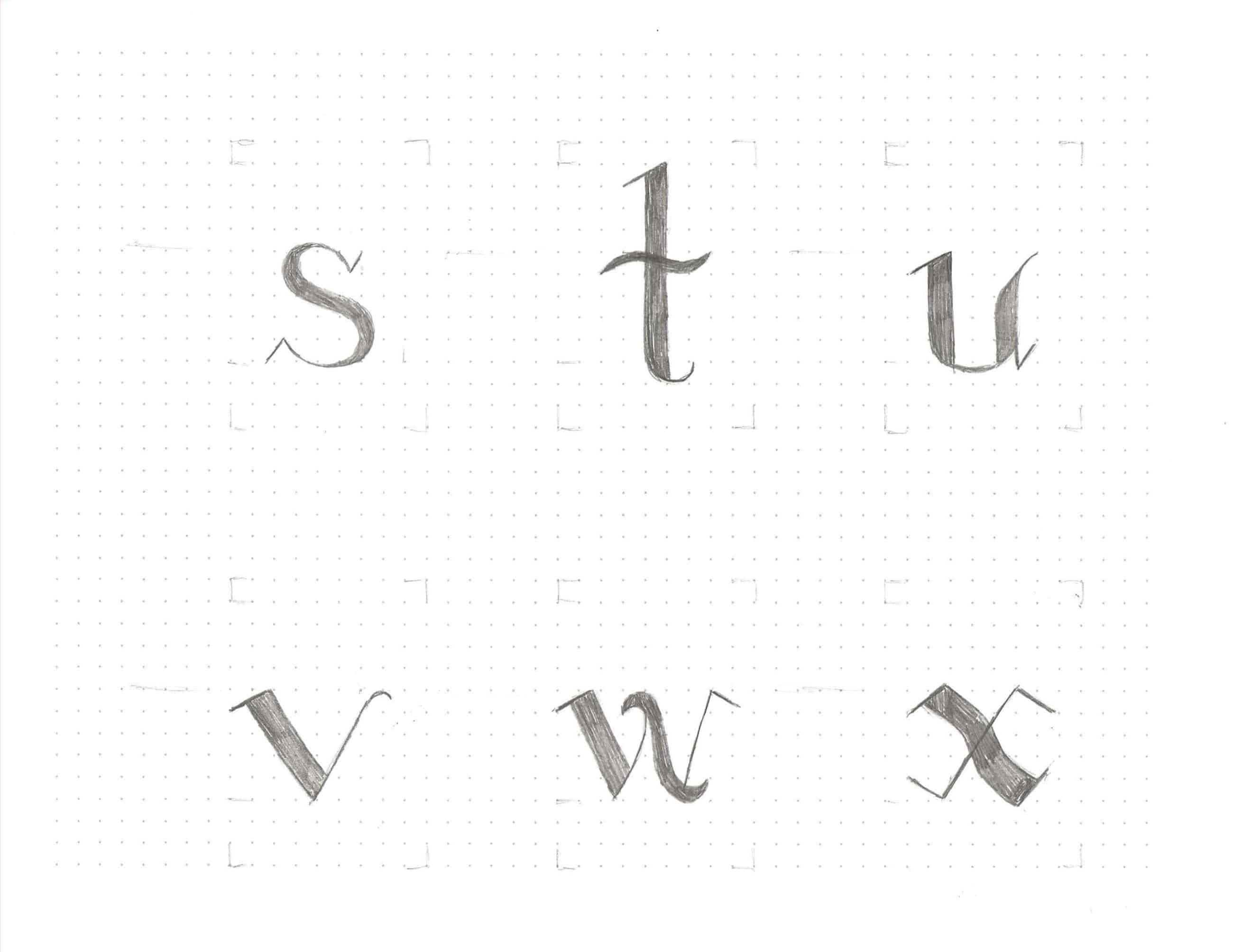
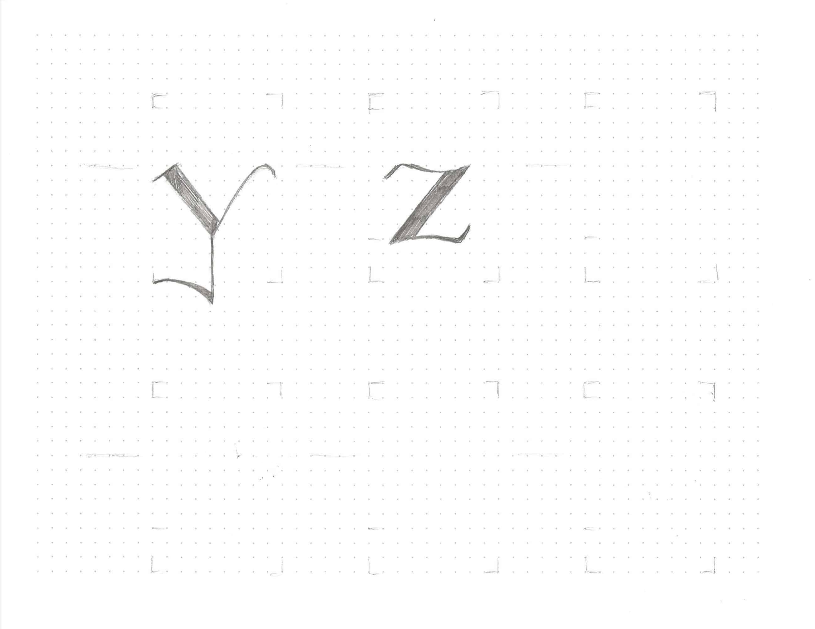
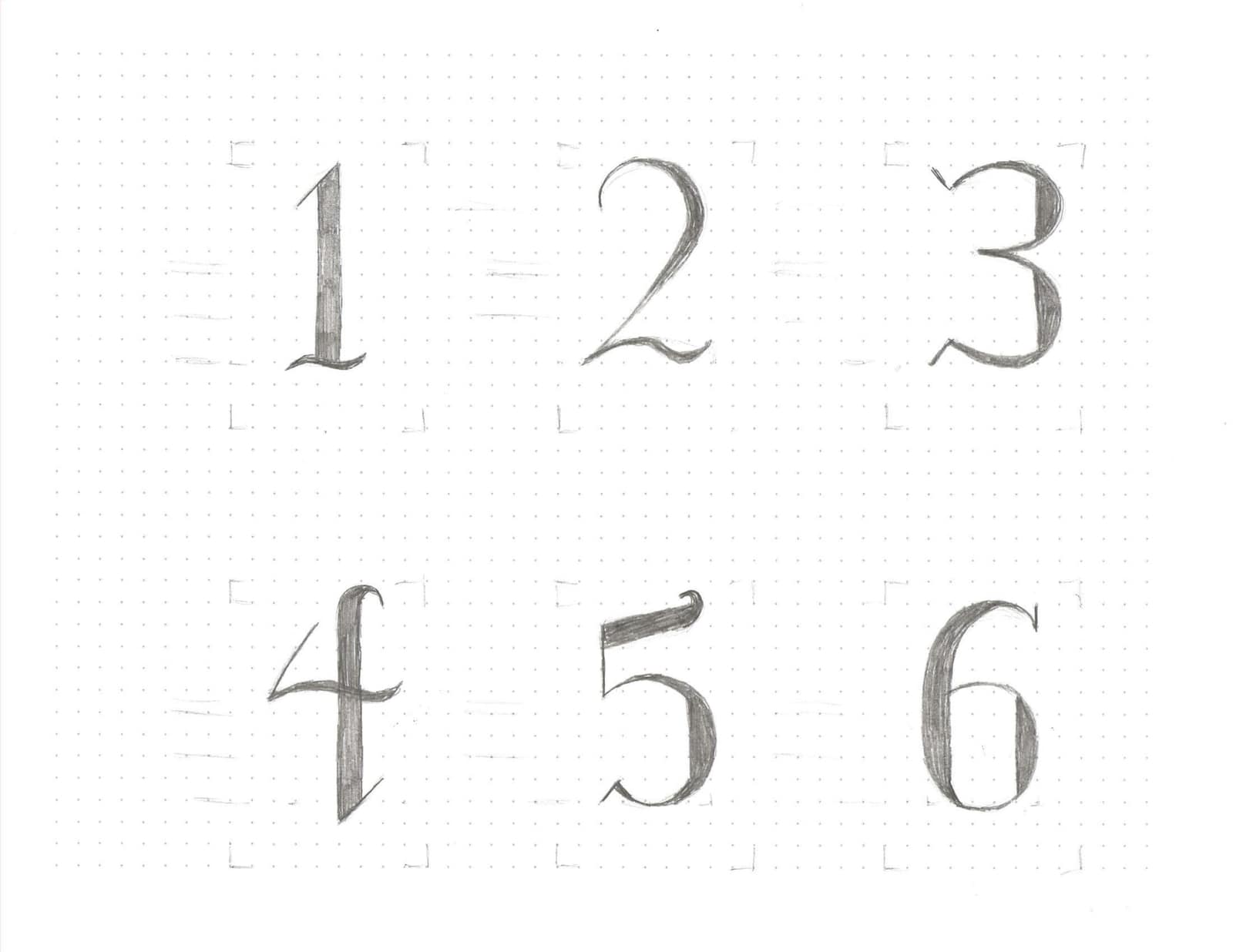
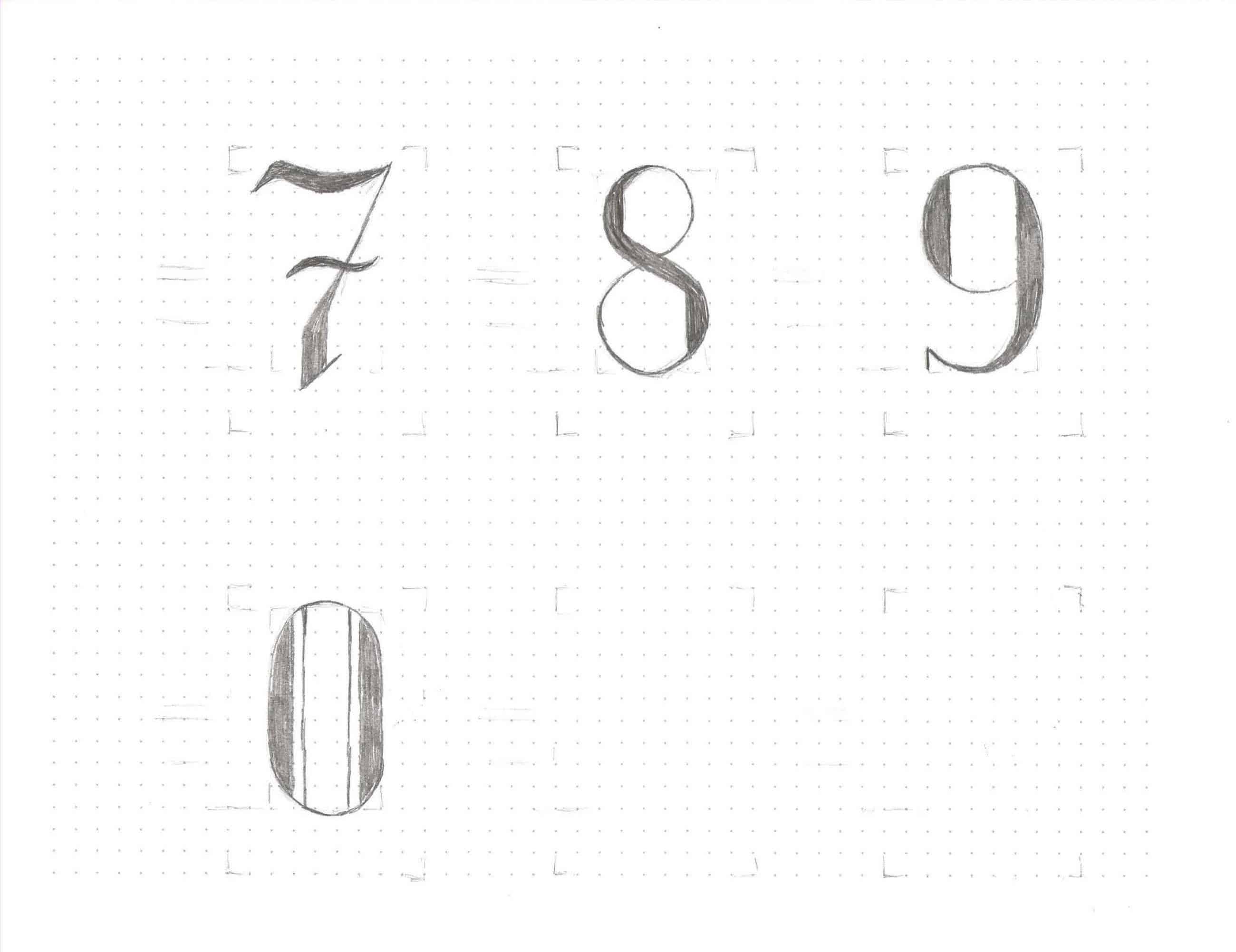
INITIAL SKETCHES
First attempt at making the entire alphabet with all uppercase and lowercase letters, and numbers.
TYPEFACE APPLICATIONS
After the sketches, then digital drawings, then finally making it into an actual typeface, applying the type to a poster, t-shirt, 3D, and a robot arm drawing opened my mind to the endless possibilities that one can create with type.
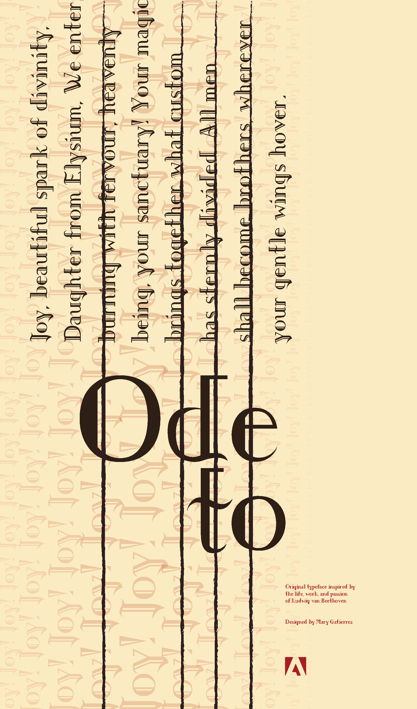
- POSTER
![]()
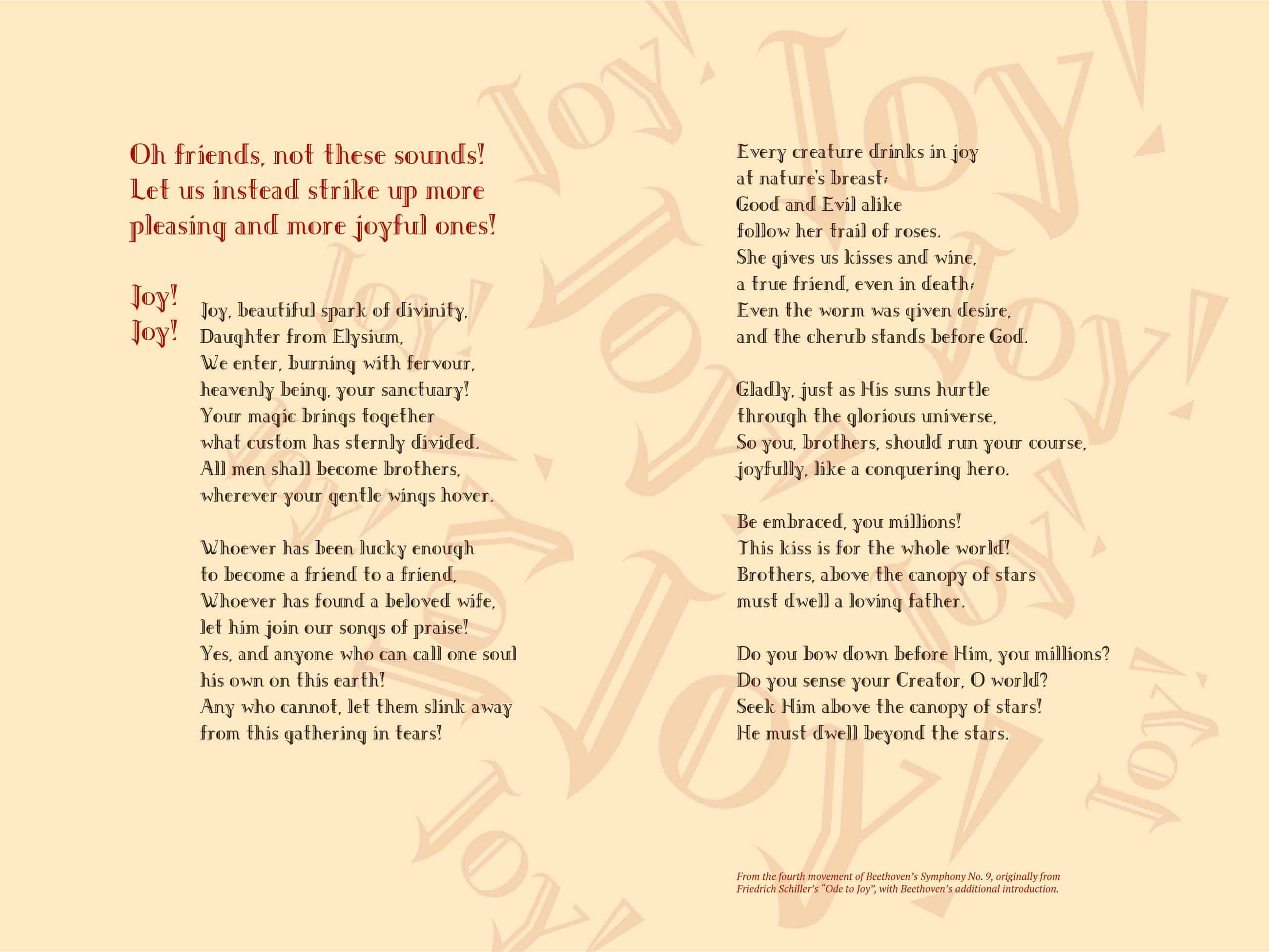
For the typeface poster, I created a space that resembles ledger lines in written music, as though this is another sheet that Beethoven would scribble composition ideas on. However, instead of musical notes and notations, I have the opening lines from the Ode to Joy, with many "joys" as a background texture to capture the feeling of an actual choir singing. -
T-SHIRT
![]()
For the t-shirt application, I created a repeating pattern from different elements of the typeface forms.
-
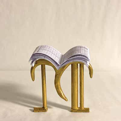
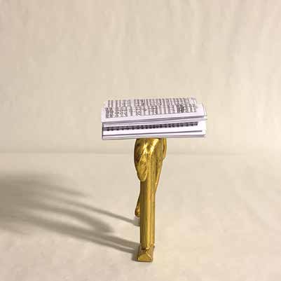
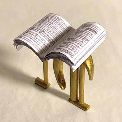
3D
![]()
![]()
![]()
The 3D application took the form of the letter 'M' and made it into a miniature conductor podium. The printed music is from Beethoven's famous Symphony No. 9, since that has the Ode to Joy.
-
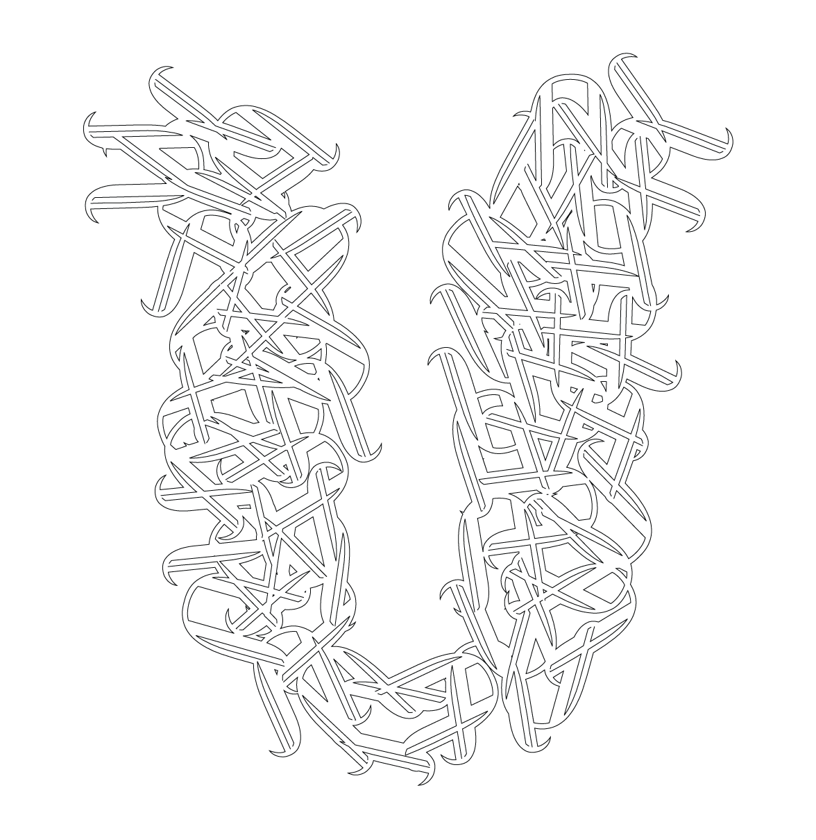
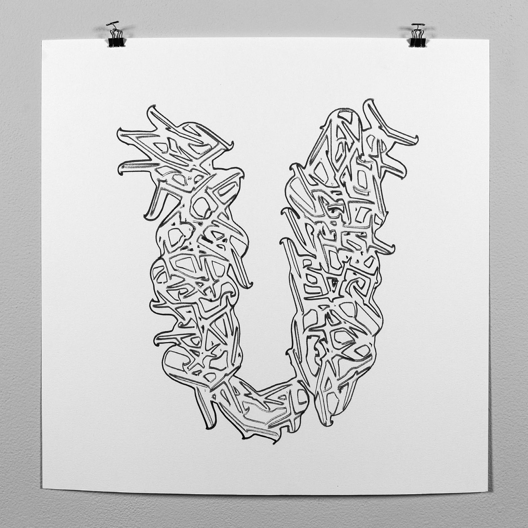
ROBOT ARM DRAWING
![]()
![]()
In an opportunity to work with a Robot Arm, I worked in Rhino and Grasshopper software to create my personal assigned letter 'U'. This U is made of many Us in this original typeface. My Illustrator drawing has a sharper look and feel, but I also appreciate the robot drawing—with its limitations and the outcomes of working with a brush and ink—for its more organic quality, and a visual feeling as if it were melting.

TYPEFACE BOOK PAGE SAMPLES