
WHAT’S IN A DAY?
Infographic
8.5x11" pages
Jan 2020 (1 month)
A 4-page infographic based on personal media tracking over a 24 hour period, along with an analysis of a selected medium, Discord.
INITIAL SKETCHES
PERSONAL DATA
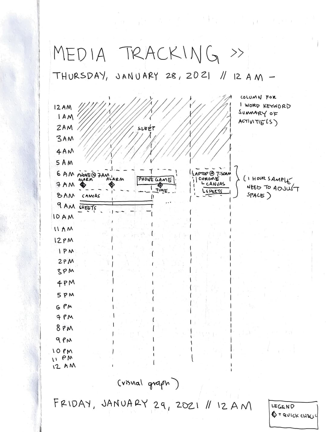
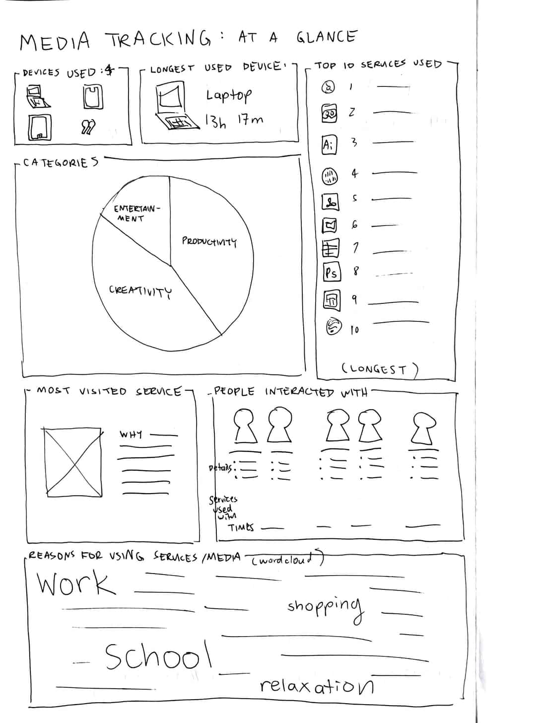
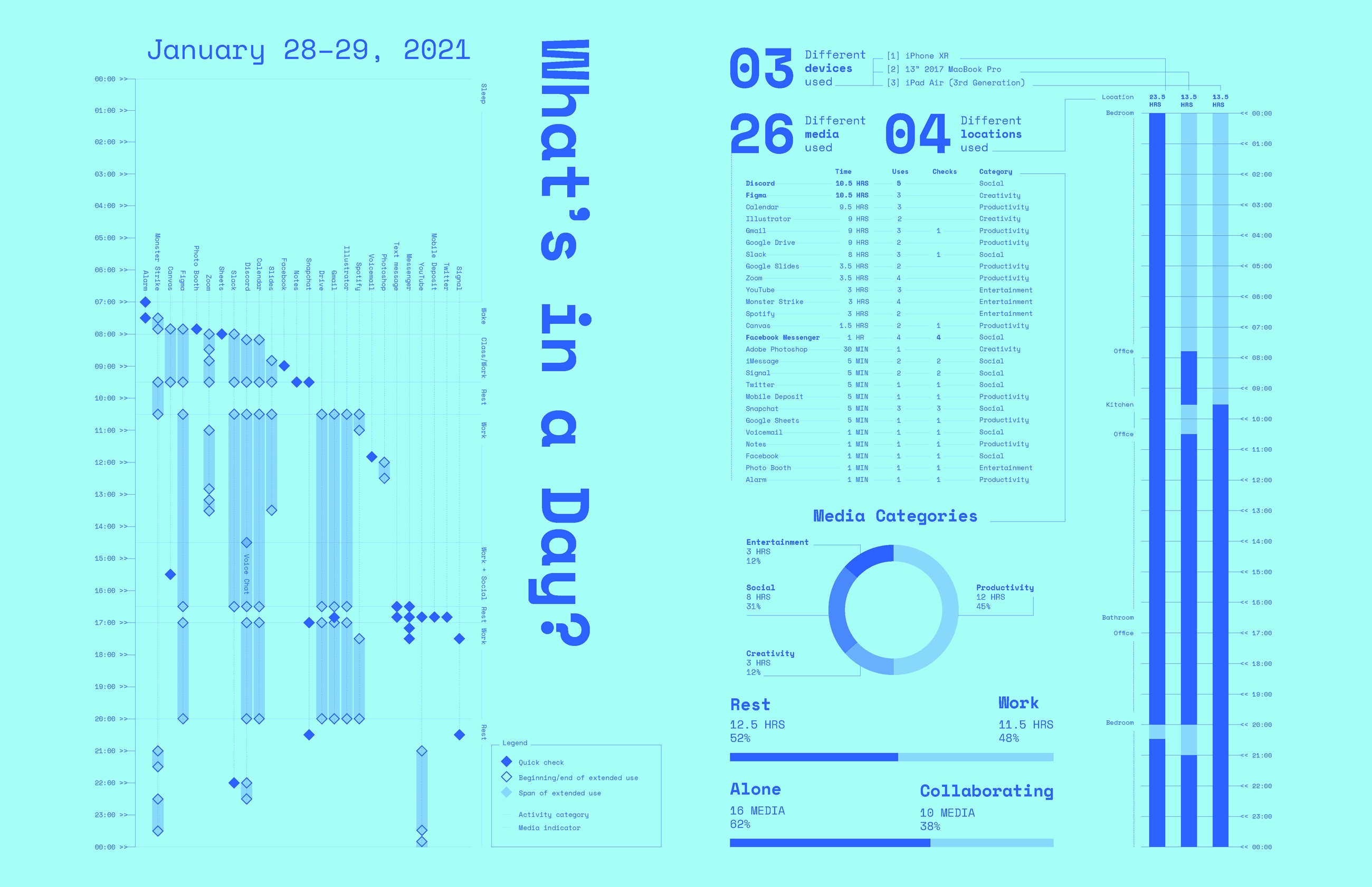
After tracking my media usage over 24 hours—I picked a particularly busy day in order to guarantee rich data—I inputted my hand-written records into Google Calendar. The vertically stacking visualization of data led me to my final concept of a first page of overall data, with a second page showing much richer details. Note: I allowed 1" margins to allow space for binding.
RESEARCH
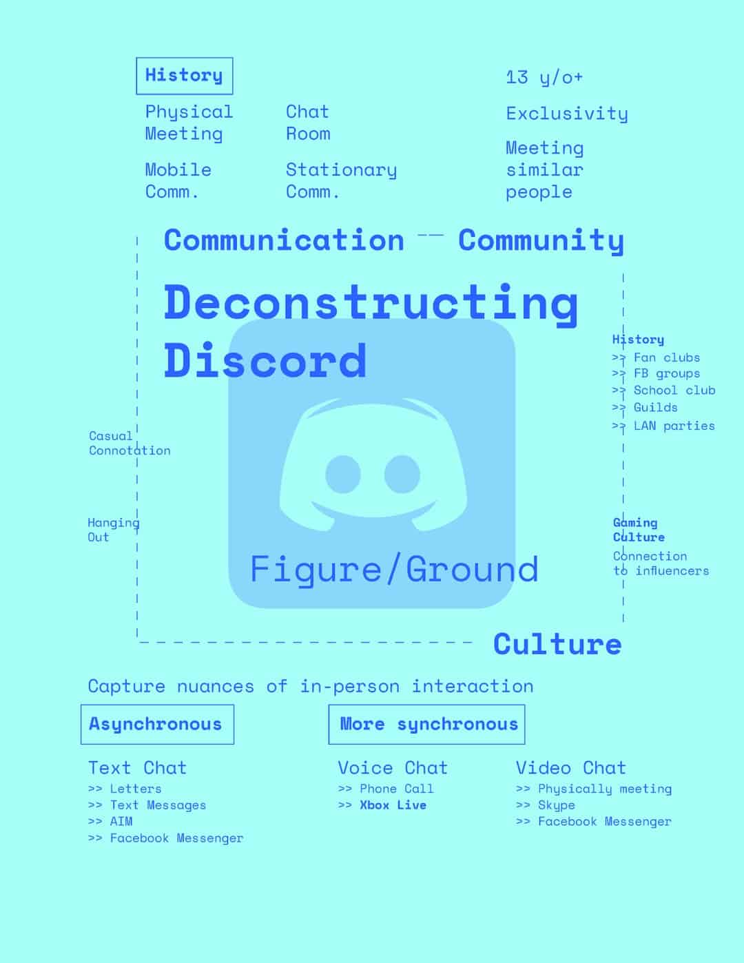
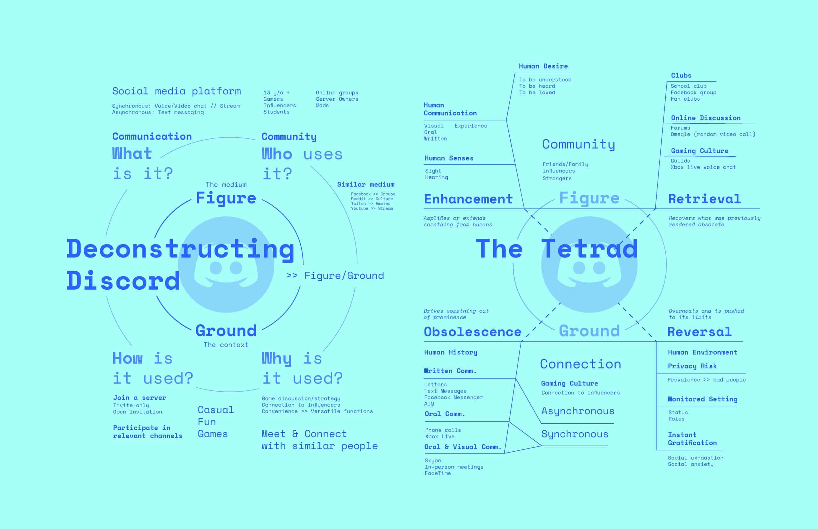
FIGURE & GROUND
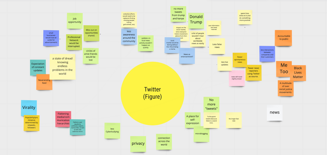
In preparation for the next two pages of media analysis, as a class, we picked one medium (Twitter) and established its functions and effects on society.

ITERATIONS
MEDIA ANALYSIS
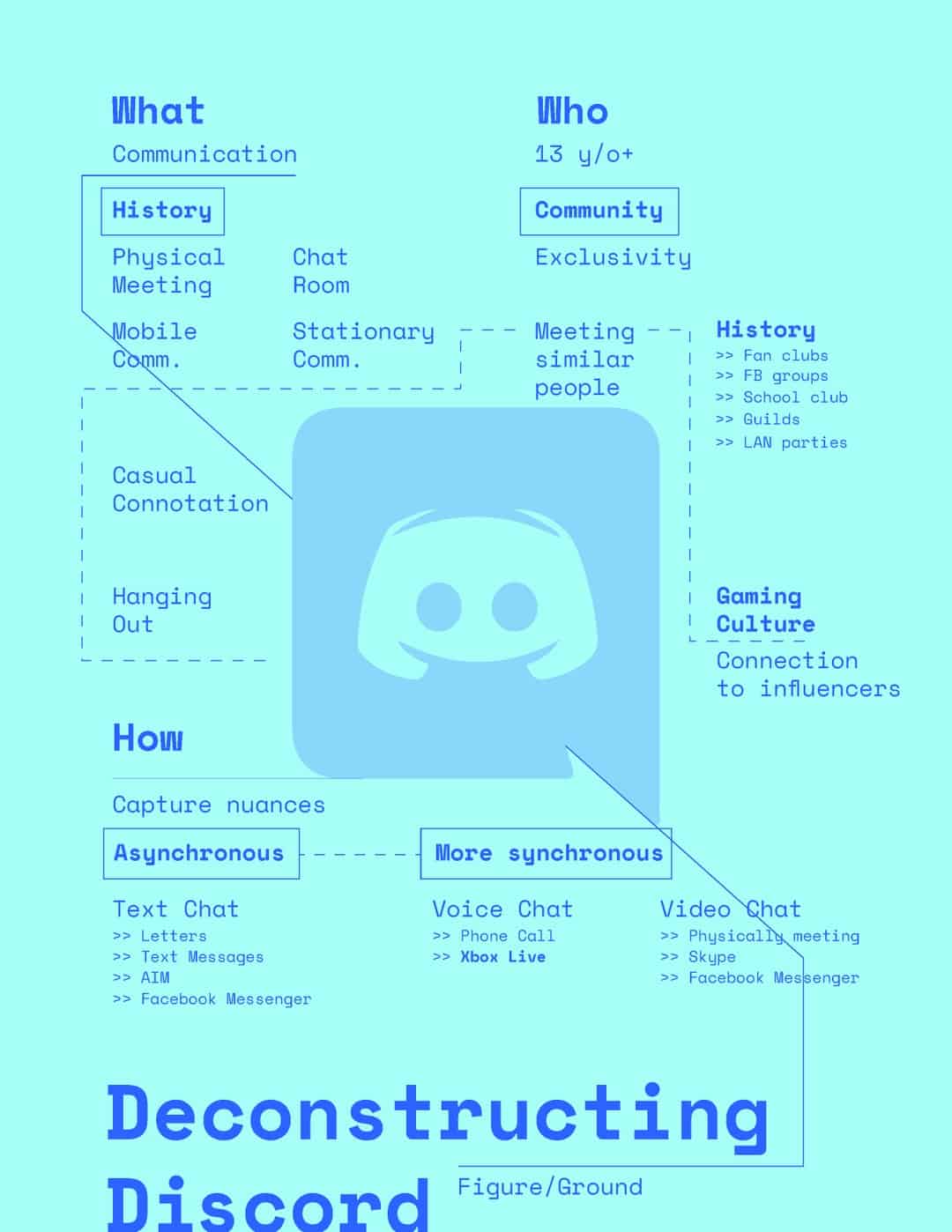
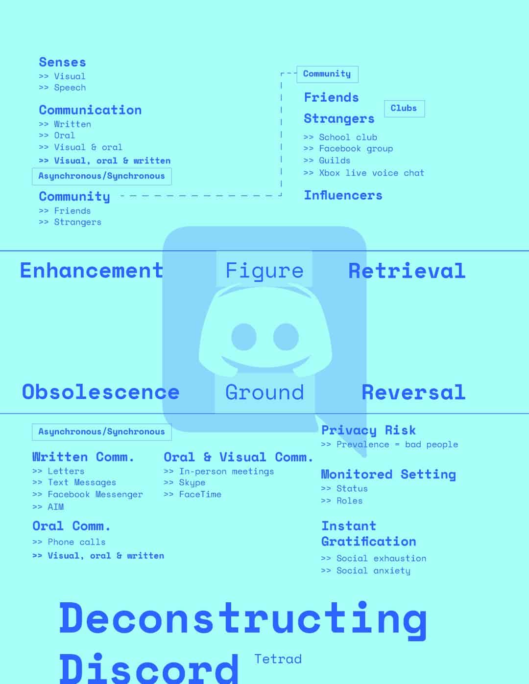
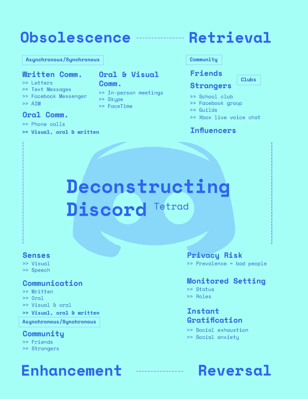
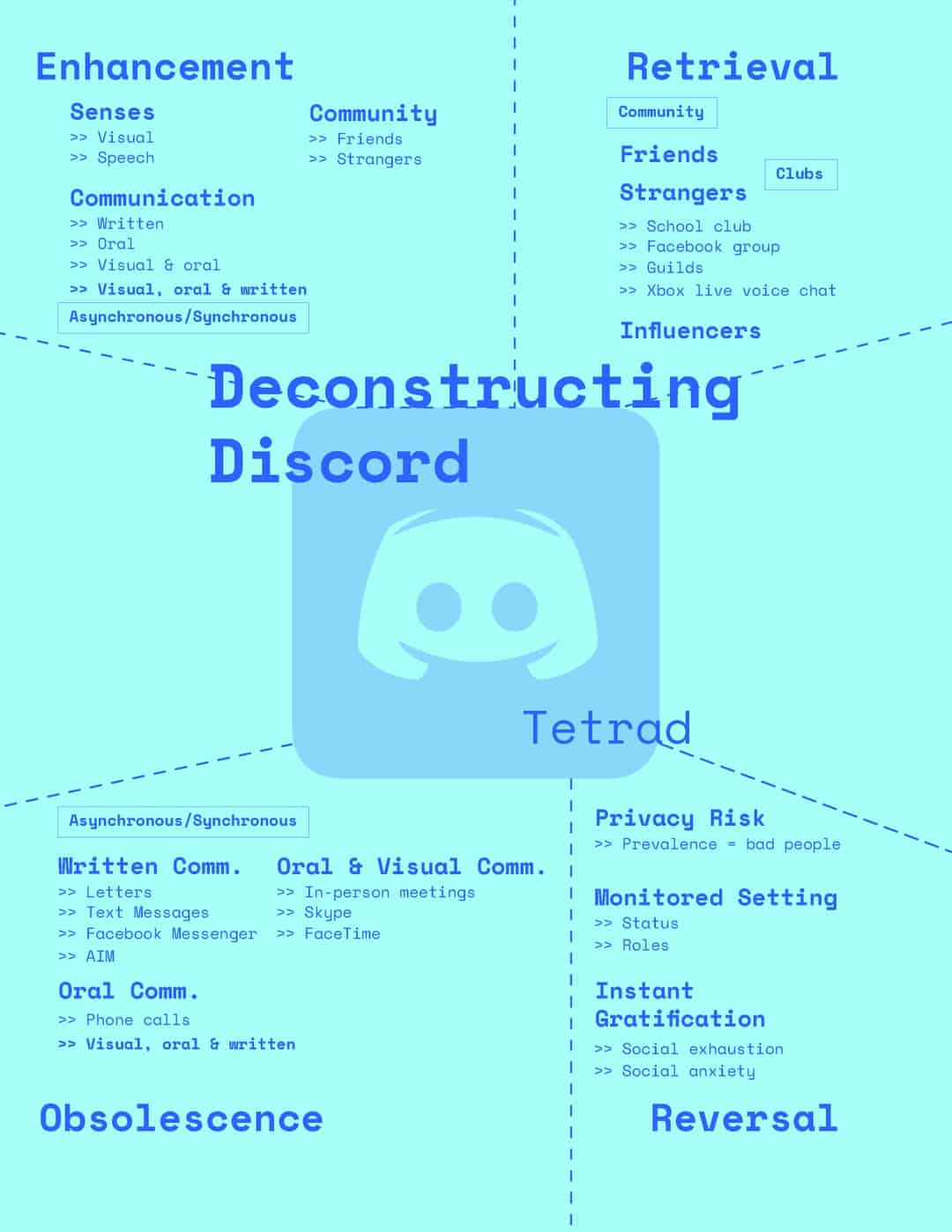
After selecting my media to analyze—Discord, the SJSU BFA messaging app of choice—I laid out the information of who, what, and how to establish figure/ground, then thought of ways to divide information into 4 sections for the tetrad of enhancement, retrieval, obsolescence, and reversal. I struggled for a while at this part, and even my final iteration could benefit from refinement after a long refresh.

FINAL SPREADS
- Personal media tracking and details.
- Discord analysis of figure/ground and the tetrad.
FINAL TALLY
24 hours tracked
3 separate devices
4 hours of Crazy Frog
︎ hours deciding colors
3 separate devices
4 hours of Crazy Frog
︎ hours deciding colors
It was very interesting to see how I behave in terms of using technology. I could have saved time if I went straight to digitally recording my data instead of writing everything down first, so having good resources that can help automate data tracking will come in handy for future data visualizations.