
FLOURISH
3D, Branding, Presentation
20'x10'x16.5'
Aug–Oct 2021
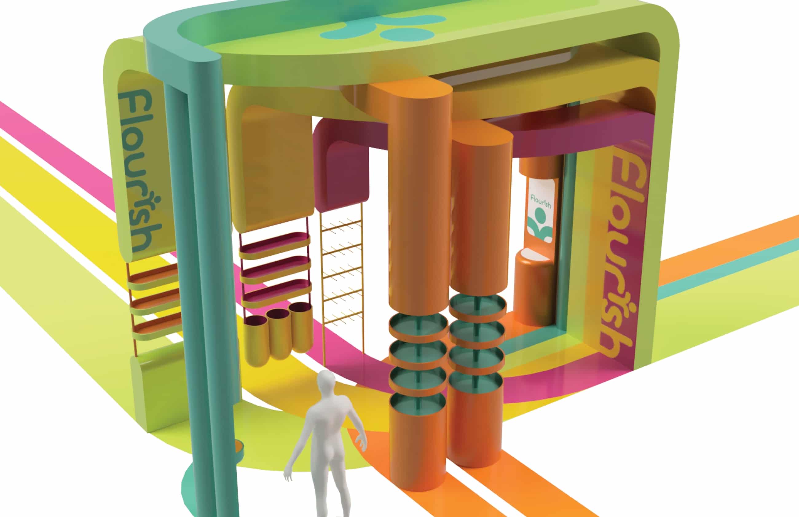
A 3D point of purchase (POP) site addressing sustainability and food insecurity at SJSU while remaining compliant with the Americans with Disabilities Act (ADA). Key images and a narrated video presentation were featured in the exhibition New Kinships: Community Dialogues and Interdisciplinary Connections from the Taste of Home project.
I learned about ADA compliancy for the first time, learned more about college food insecurity and sustainability, and I also got much more familiar with Fusion 360 and how to think in 3D—there is no a "back", so we must design with all views in mind.
PROCESS
From thorough research on topics and products to initial sketches, a revised concept Fusion 360 struggles, and the final outcome.
- COLLEGE FOOD INSECURITY RESEARCH
In a randomly selected group with Linh Hoang, Wenwen Su, and Tianting Sun, we researched food insecurity globally, state-wide, and at SJSU, along with food literacy. We also analyzed the programs of CalFresh, Campus Community Garden, Second Harvest of Silicon Valley, Spartan Food Pantry, and Swipe Out Hunger.
You can check out our research presentation in its entirety here.
- INITIAL SKETCHES
![]()
![]()
![]()
![]()
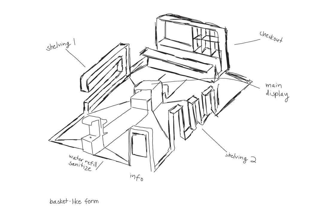
I knew that I wanted to create a comfortable and convenient space for SJSU students, so my initial sketches were centered around the concept of "open area self-service". My initial struggles were properly visualizing scale, how to handle the checkout section, and having enough room around each structure to remain ADA compliant.
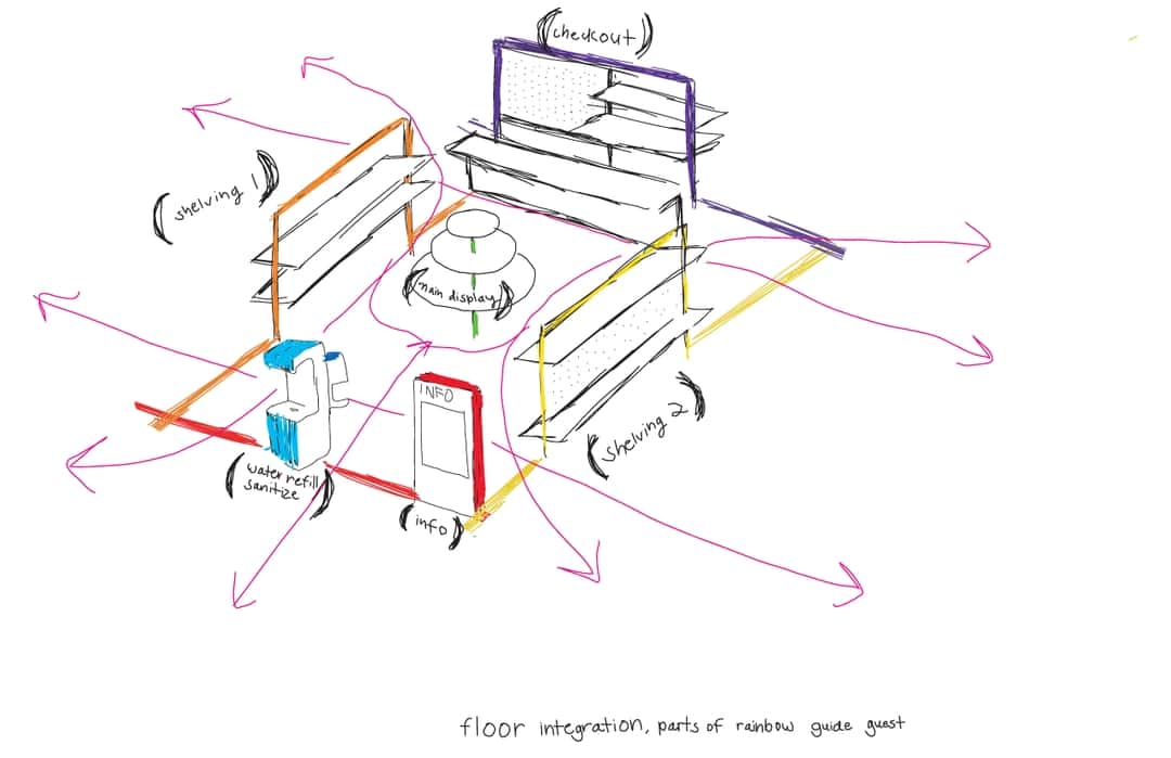
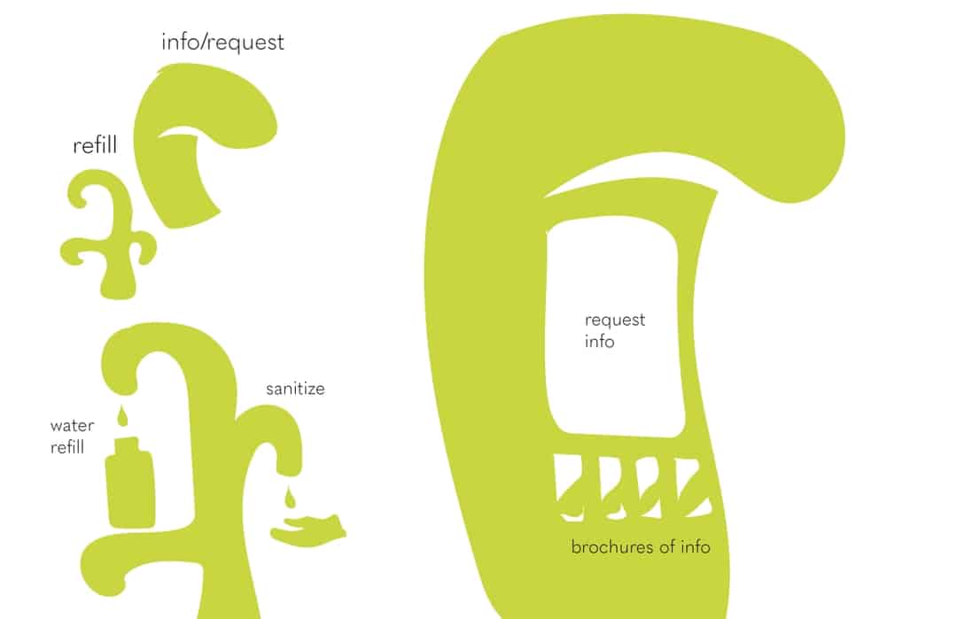
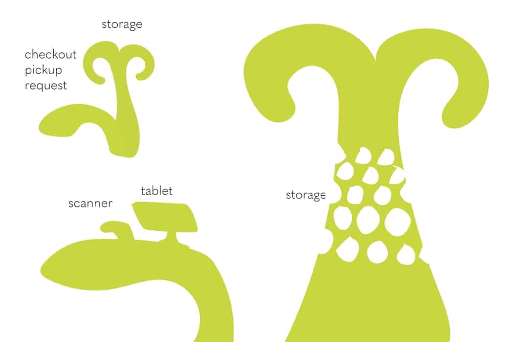
- REVISED CONCEPT
![]()
![]()
![]()
![]()
![]()
![]()
![]()
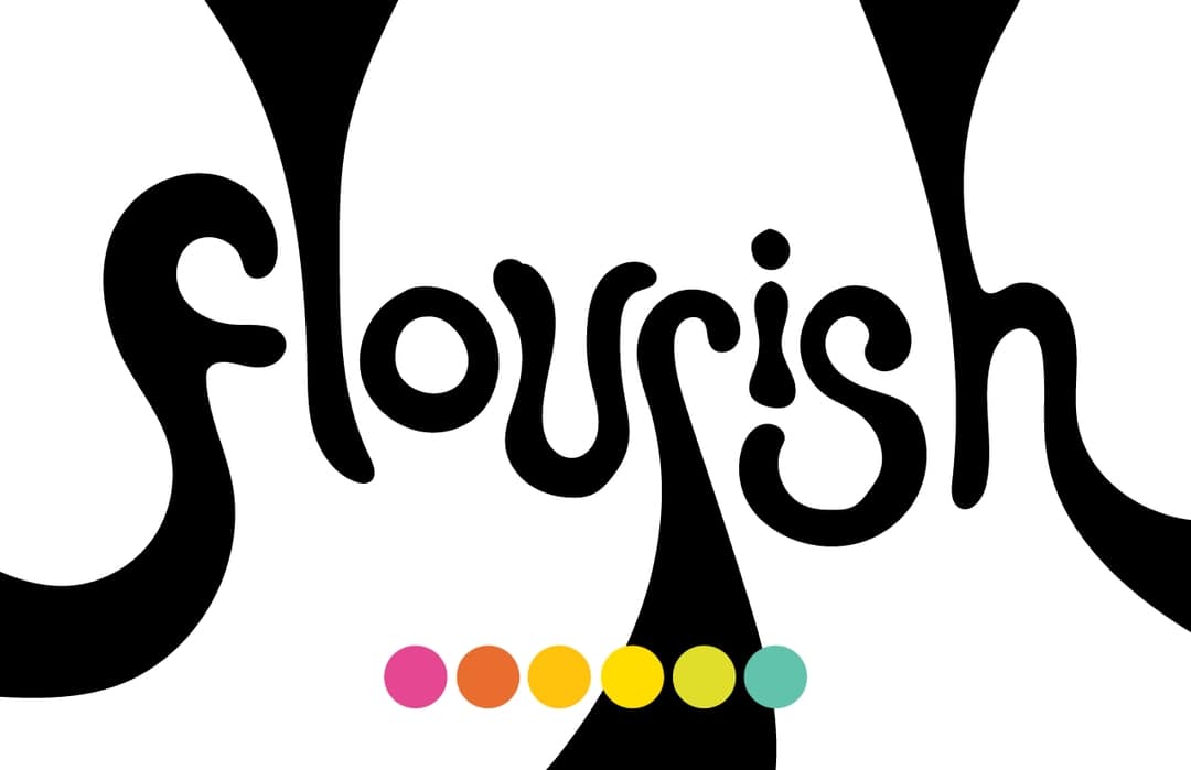
After establishing the color palette, I began developing the logo wordmark and visual of a person in the 'i'. I was still playing around with the layout of the site, taking away all unnecessary parts, envisioning a traffic flow, and considering floor graphics to better connect each structure. I struggled with making a form for each structure that was interesting, practical, and intuitive.
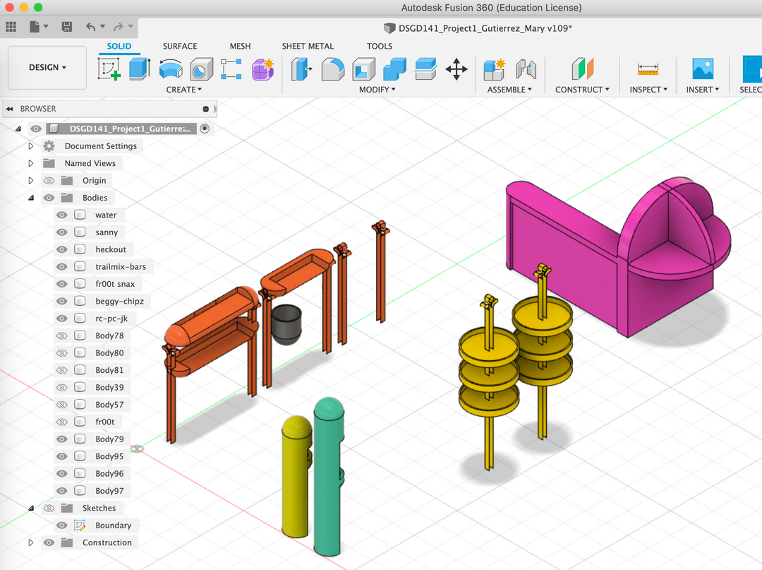
- FUSION 360 STRUGGLES
![]()
After researching exactly which foods and features I want where, actually modeling the forms in Fusion 360—which I would be using only for the second time in my life—was quite challenging at first. I dedicated a week to really changing the site from disconnected forms to a truly unique final outcome.


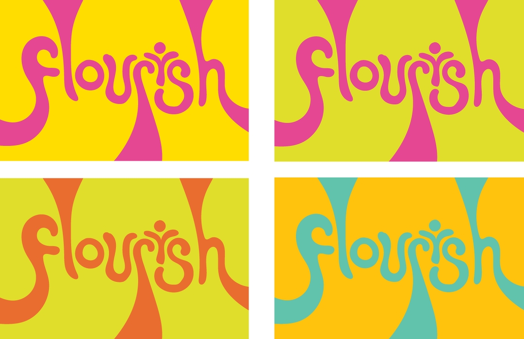


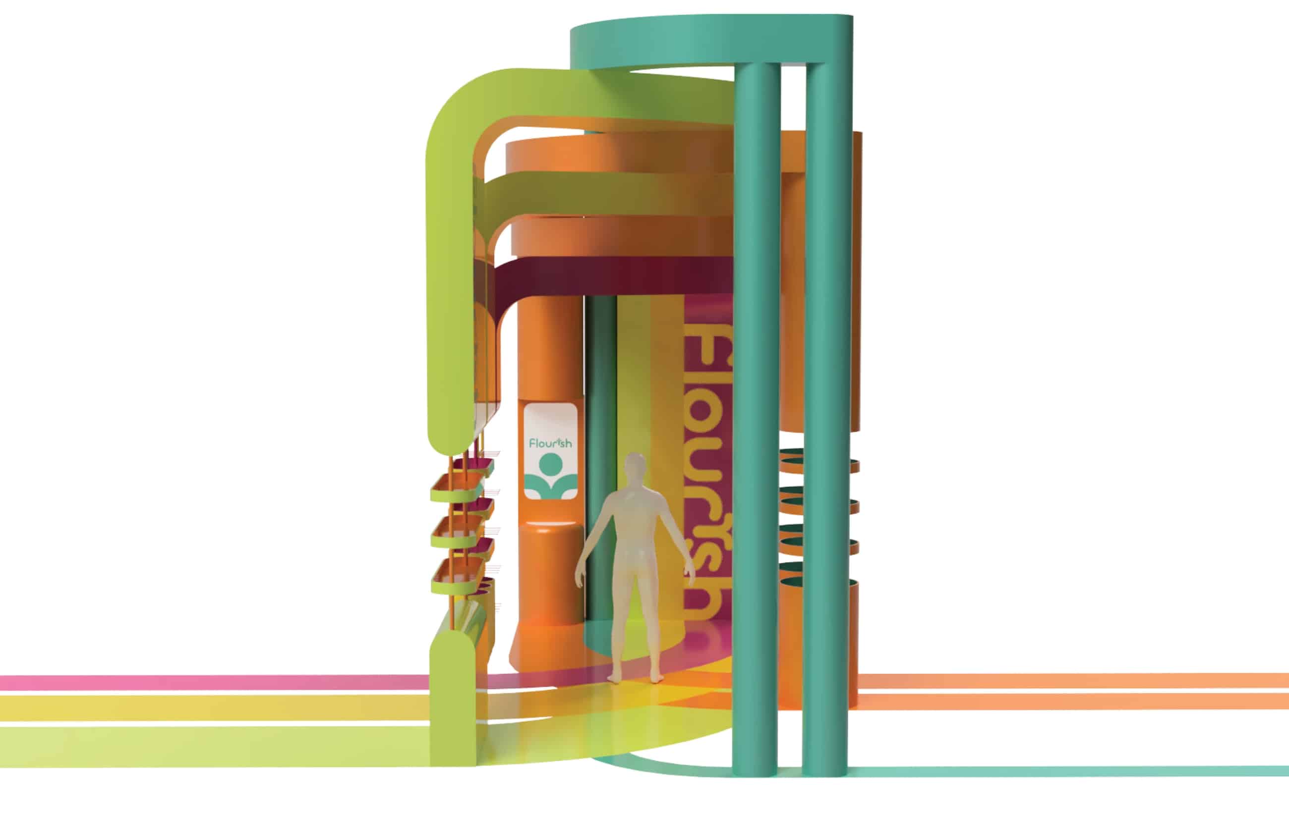
BRAND IDENTITY
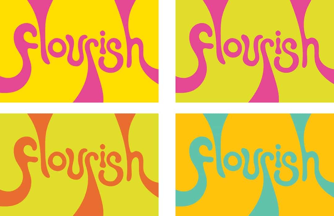
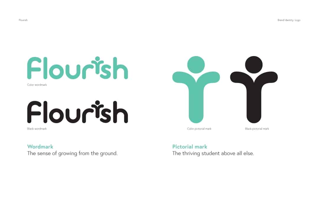
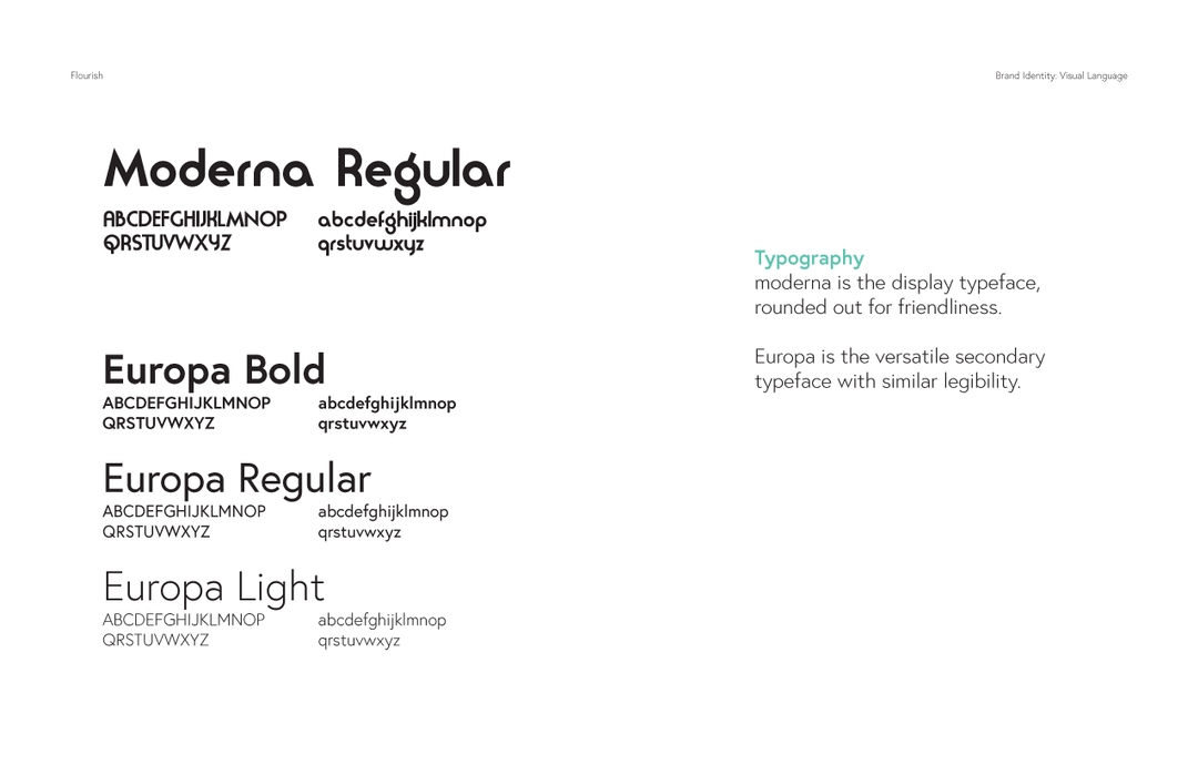
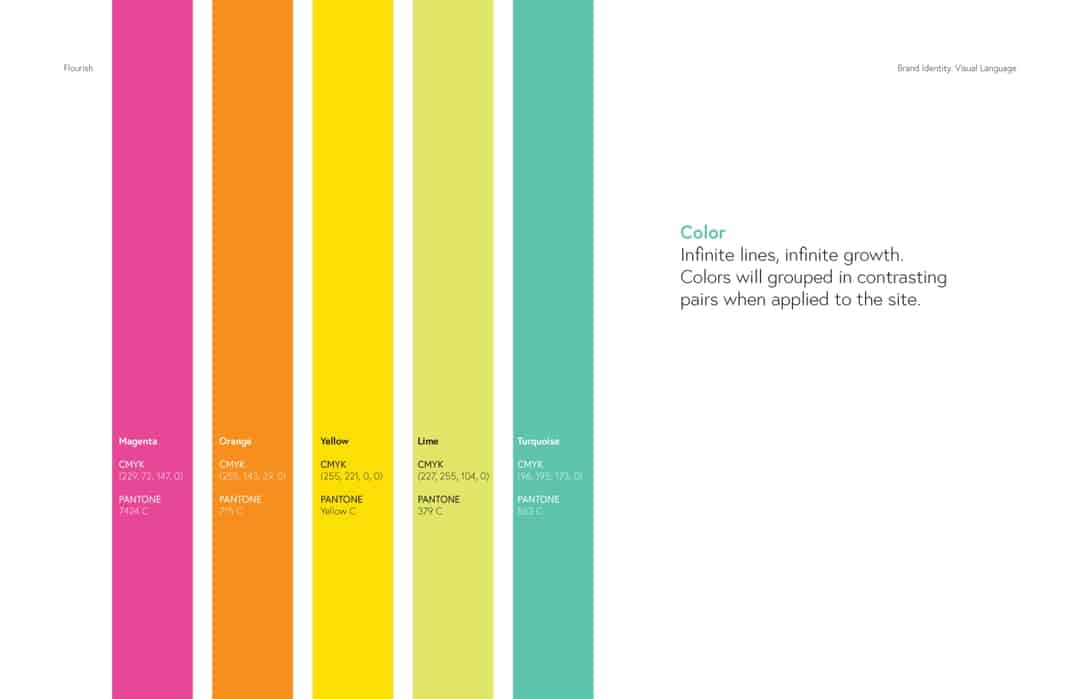
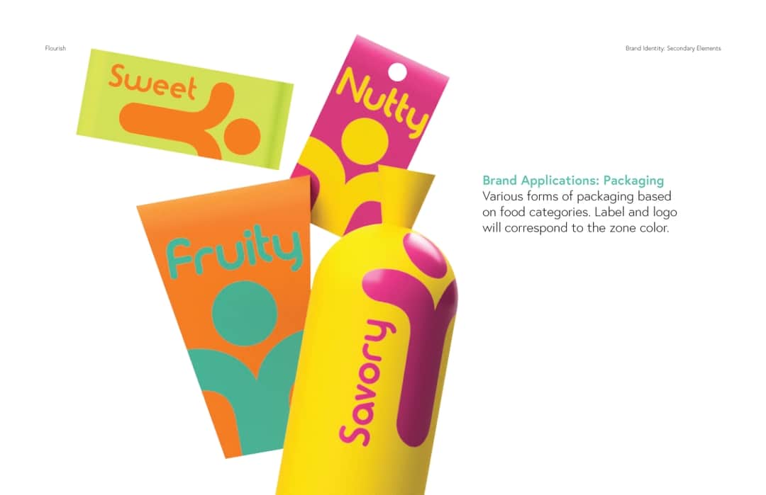
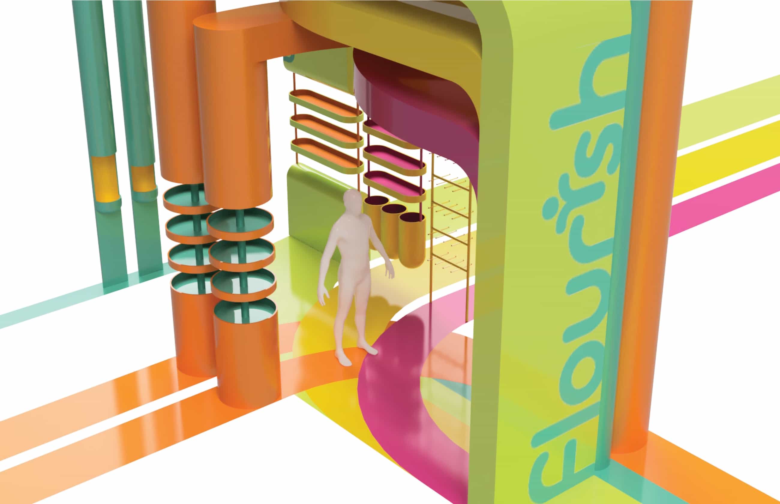
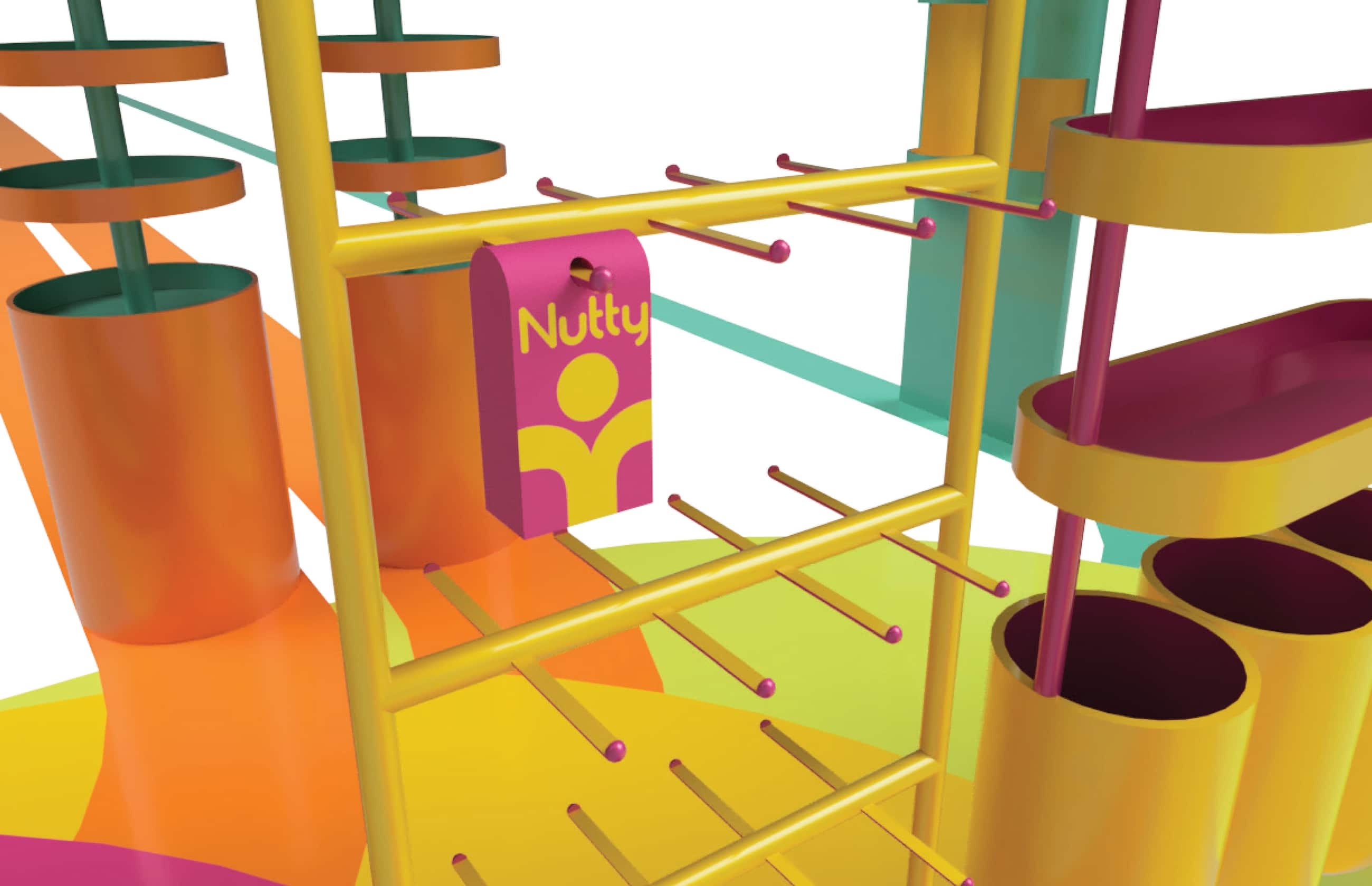
The logo is organic but still structured, with the touch of the 'i' representing the thriving student. Typography is kept rounded, legible, and friendly. The color palette is used to match contrasting pairs in site applications. Packaging color codes each food category to its respective zone—whether it be fruity, nutty, savory, or sweet.
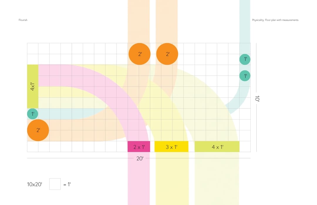
FLOOR PLAN
The floor plan shows the site's overall connectivity; The floor graphics exactly mirror the structure of the ceiling.
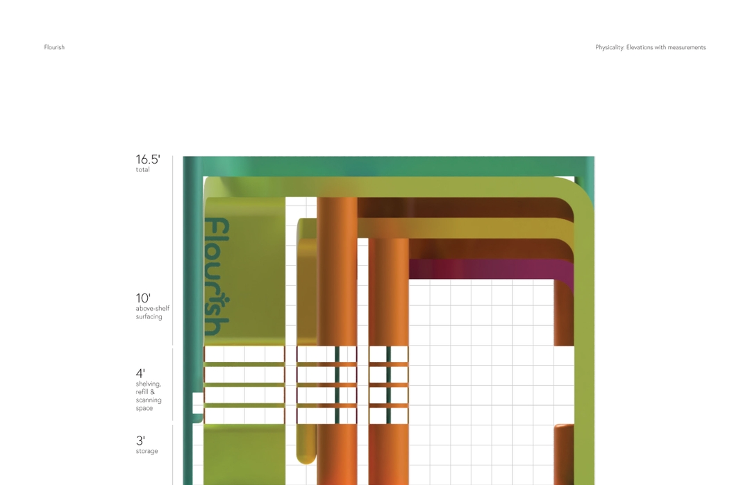
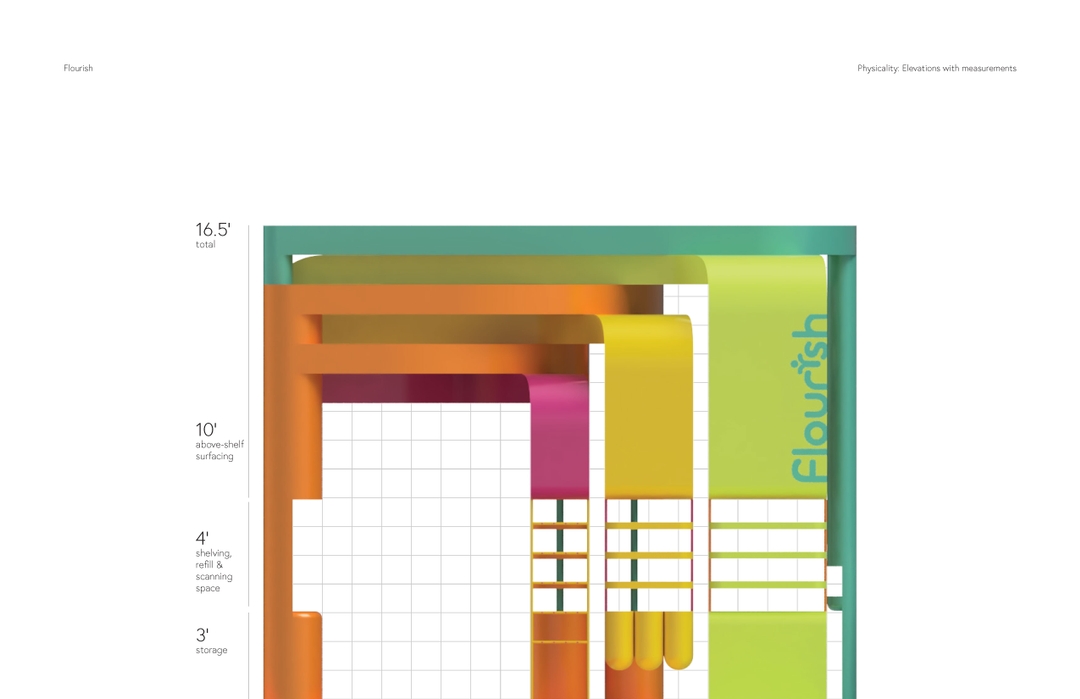
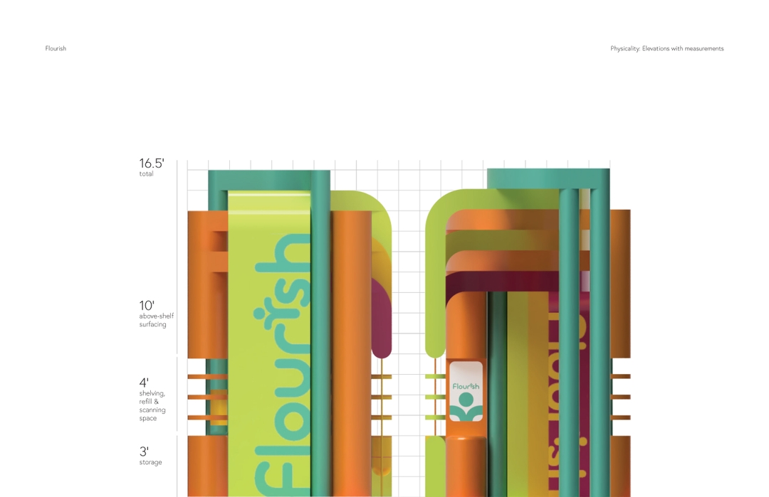
ELEVATION VIEWS
Elevation views reveal that exact measurements were carefully put into consideration for ADA compliance.
FINAL RENDERS
All made in Fusion 360.
THE MEANING OF FLOURISH
-
Grow or develop in a healthy or vigorous way, especially as the result of a favorable environment.
- A bold or extravagant gesture or action, made especially to attract the attention of others.
Overall, the goal of Flourish is to allow college students to be healthy and feel taken care of by their school. Although Flourish is targeted towards SJSU students, the concept of this site can definitely be used by other colleges as well.